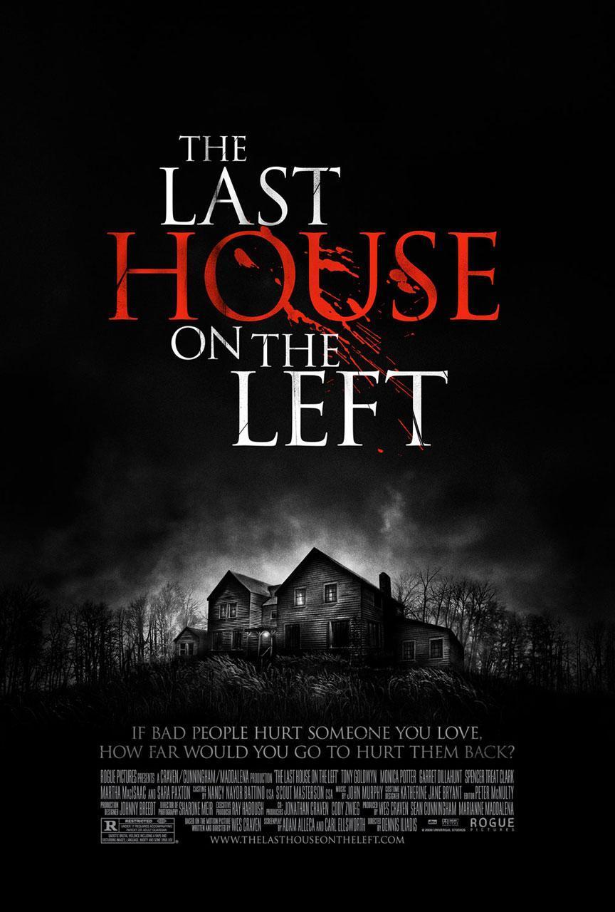
The only bright colour that is on the poster is the bright red which makes it stand out to the target audience more. Considering it is only the word 'House' That is written in red suggests that it is the main object of action within the film. The colour red gives the connotations of danger and blood/violence which instantly tells the audience that it is a horror film.
The dark background reflects the mood of the film which is dark and mysterious, which visually informs the audience that it is a horror film. Also the mist in the background create a sense of mystery for the target audience but also builds a spooky but questionable atmosphere around the image of the house.
There is a glow around the back of the house showing a contrast between the dark background and the brightness of the house but is also marking its importance to make it stand out from the rest of the poster.
The tagline is positioned right below the main image of the poster which makes it eye catching for the audience to see, ensuring that they do not miss it when they are looking at the poster. It makes direct reference to the film but also gives a small insight to the plot and what the film is about or what we as the audience can expect from the poster.
No comments:
Post a Comment